Here’s a checklist of Facebook Page tips to make sure your page is optimised
1: Design Your Cover Photo Without Worrying About Mobile version cut-offs.
Now Facebook page cover photos are not overlaid by buttons, profile pics or text.
No need to worry about fitting those into your design.
New cover photos will be shown entirely.

Your cover photo size should be 820 pixels wide by 462 pixels tall on desktop browsers, and on mobile browsers at 640 pixels wide by 360 pixels tall.
When designing your cover photo, take the mobile view into consideration and keep the main text and details within the mobile view.
The mobile view can get quite cluttered if there is too much text. Leave off what is not essential in the mobile view. Upload and test to see what both views look like.
If you don’t have good photos and aren’t a designer, you can always use stock photos or services like Canva to create a Facebook cover photo for your page.
Give the cover photo a link and description. It’s a great opportunity to link to the best page on your website or an offer page.
2: Add a Call-to-Action Button
The new CTA button design is more prominent therefore, if you haven’t already done so, now is the time to add a CTA button to your page. Otherwise, your page will look like there’s something missing.

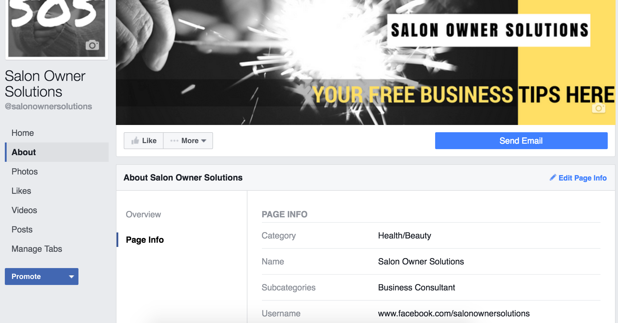
iTunes hasn’t got one and it looks naked!

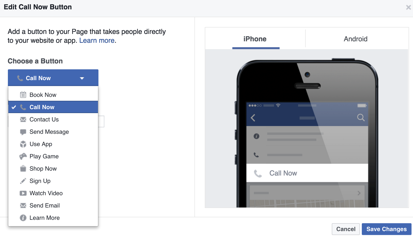
BMW shows how a prominent call to action button is now very clickable. The bright blue button stands out more than the ‘like’ button. On mobile ‘Call Now’ is a very helpful and enticing choice for your customers.
You can choose book now or call now as the most appropriate for a salon or spa.

CTA buttons are important for mobile visitors too.
You can create different CTAs for desktop and mobile users. For example, you can set the CTA so mobile users have the option to call instead of go to your website, if that’s your preferred option.
Simply
- go on your phone page app
- click the button
- choose call now
- add phone number details.
3: Make Sure That All of Your Tabs Have Content
Tabs are more prominent so fill them out and fill out the content section completely.
Choose the appropriate template.

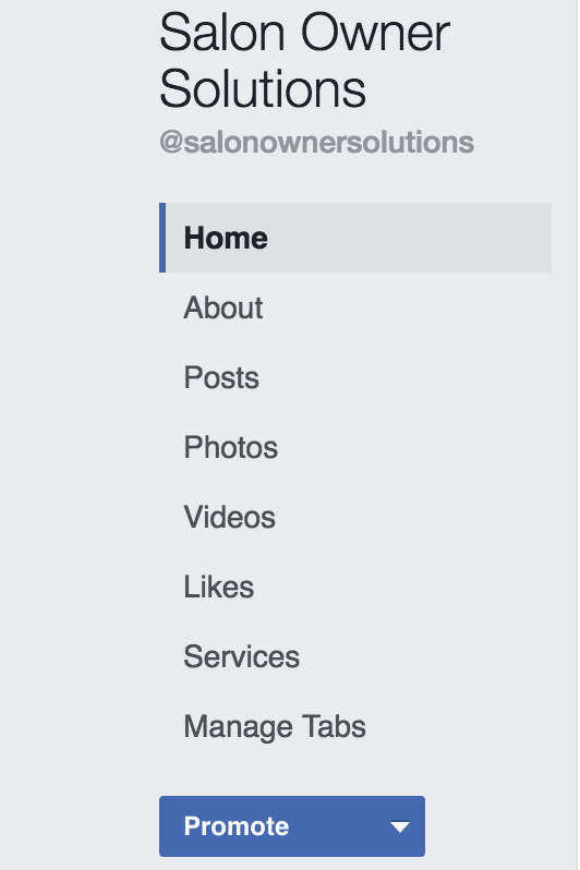
Tabs on the left are static now, so make sure you fill out the important information.
Also, since you can’t get rid of main tabs like Photos and Videos, be prepared to create some visual content to go in your main tabs as well.
Ideally, you’ll want to add at least one featured video so people can get a good impression of your brand, products, or services. The featured video not only appears on the Videos tab, but will also appear above your About box, now on the right side in the new design.

Click ‘Add Feature Video’ and choose one of your uploaded videos to create a featured video.
You may also want to consider removing tabs that don’t contain current content, such as an Events tab when you no longer post new events. That way, people aren’t clicking on things that don’t have relevant content. This also applies to any custom tabs you’ve created.
Speaking of which…
4: Add Custom Tabs
The old design could only show four tabs, and the rest would be put under the More drop-down menu.

This meant if you wanted to add custom tabs, for example to get email subscribers, show off your Instagram photos, share your tweets or videos, most of those options would be hidden under the More drop-down menu.
With the new design, all of those custom tabs are shown in the left sidebar.

Custom tabs are displayed on the left.
Now custom tab links stay in place while visitors scroll down the page, so they always have the option to click on them while browsing the page’s posts. So if you were considering doing so, now is the time to add custom tabs for custom features.

Go to Settings – Apps and choose what you can upload from here.
 LATEST UPDATE
You can now rearrange how your feed looks on your page. It shows up how you have your tabs arranged on the left.
If you want your videos to be the first thing someone sees on your page choose Video after Home or maybe you want Photos so choose that.
To manage your tabs click – Manage Tabs.
A new page will appear where you can edit your tabs as previously shown before, but here is the newer version.

Here you can click and drag your tabs into any place on your feed and you can show what you want first.
We like to have posts first so visitors to our page can see our latest posts first.

Pro Tip If you haven’t already made a video playlist, now is the time to do that as your videos will show up on your feed and you can select which ones you want visitors to see.
4: Add Your Story
Fill in your story.
It can be found here.

When someone clicks See More, it goes to a whole page where you can fill in pictures and links. A bit like an about page on your website.
Over to you.
Continue regularly posting a variety of content that engages your target audience. Experiment with Facebook’s latest features like Live Video.
Read our post on enhancing your Facebook engagement to get more out of your Facebook marketing efforts HERE.
If you want to Build an Online Presence That Gets Your Salon Noticed
Join the Social Hub
There are Blogging & Branding Checklists so you can craft your salon’s brand for success, Facebook Post/Ad Templates to take the hassle out of your social media posts this week, and an Ideal Customer Worksheet to help you uncover who you want to notice your salon online.


